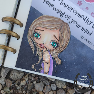
Today is the 1 October. I cannot believe that we have started the last quarter of 2020 already. But it is also time for a new Progressive Challenge at Outlawz and our sponsor this month is Oddball Art. The image is called Sugar the Zombie.
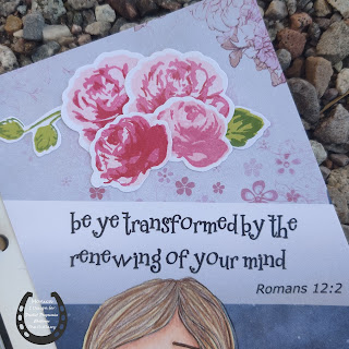
Well zombies and anything Halloween is not my thing, so I decided that this image needed to become a journal page. The scripture came to mind when looking at her and so the page came together. I created a 4×6 inch panel in Silhouette Studio and added two digital background papers. The one on the lower side is a paper from the Galaxy Digital Paper set by Pe De Designs and the top one is a paper from The Paper Shelter that I tweaked the hue of. I added the gradient in the middle to highlight the verse. I added the digi to the bottom left-hand corner of my design
I colored the girl with my Prismacolor colored pencils. The roses on the top are stamped with Memento ink and a layering stamp from my stash and cut out with the coordinating dies.
We look forward to seeing your projects with this month’s image and invite you to join the Progressive Challenge at the Outlawz. You have a month to enter.
In line with new European Data Protection Laws (GDPR) by commenting you know that your name and comment are visible to all who visit this blog and thereby consent to the use of your personal information for this specific purpose.
Many thanks for visiting and commenting on my blog!
Monica


Very cute! I have such a difficult time with this type of image. I've had to make so many lately, each one is more difficult than the one before. At least this one had a more normal version.
Fabulous journal page, beautiful and love those bright blue eyes, hugs, Lori m
I love this page, Monica! Great coloring and beautifully done roses. 😀
I'm with you about Halloween images -great journal page and love the roses-sorry for late comment but only just shown up on my reading list?
Carol x
Monica, this little cute Zoombi's eyes look so real! And as if they were filled with tears … Your coloring is amazing and so touching. The perfect journal page. I believe that this image is much better used in this way. And I love your layered roses, they look gorgeous
xx